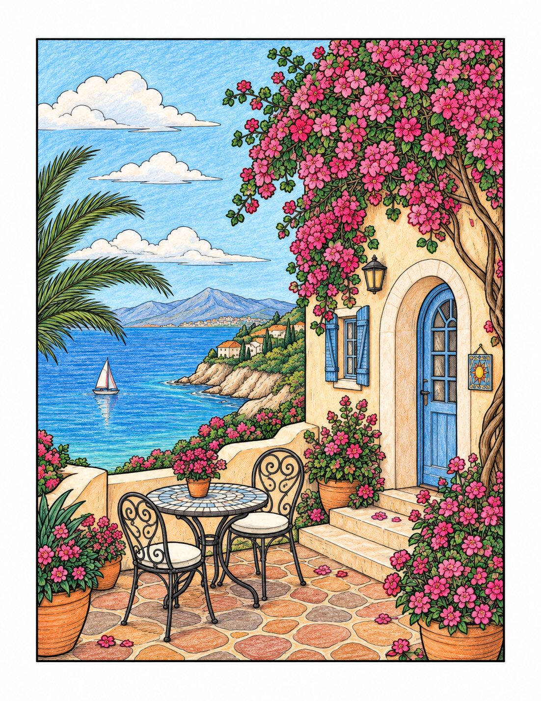
Opening a case filled with dozens of colours can be inspiring, but it can also make the first step harder. A palette is not a rigid rule: it is an initial selection that reduces decisions and creates a visual relationship between different parts of the drawing.
1. Decide what atmosphere you want
Think about a feeling before choosing exact shades: warm, calm, nocturnal, cheerful, mysterious or natural. A calm scene might use muted blues and greens; a cheerful one could begin with yellow, coral and turquoise.
2. Start with five colours
Choose one dominant colour, two supporting shades, one accent and one light or neutral tone. They form your base rather than a strict limit. Add more only when the illustration needs them.
3. Use a simple colour relationship
You do not need to memorise colour theory. Start with several shades of one colour; neighbouring colours such as blue, turquoise and green; or a contrasting pair such as blue and orange, using one of them sparingly.
4. Test the palette together
Make small swatches on a separate sheet and place every shade next to the others. This reveals colours that are too similar, a missing dark tone for shadows or an accent that dominates too strongly.
5. Distribute colours deliberately
Use the dominant colour in the largest areas, supporting tones for variety and the accent in small places. As a loose guide, think of roughly 60% dominant, 30% supporting and 10% accent—without trying to measure it exactly.
6. Remember neutral shades
Whites, greys, browns, creams and black give bright colours room to breathe. If everything has equal intensity, nothing stands out. Light and neutral areas create visual rest.
7. Repeat colours to create unity
A shade used in a flower can reappear in a window, a garment or a small reflection in the sky. Repetition makes separate elements feel as though they belong to the same scene.
What to do when a colour feels wrong
Do not cover it immediately with many layers. Repeat the shade in another small area or place it beside a colour already in the palette. Sometimes the shade is not wrong; it simply has no visual relationship with the rest of the page yet.
A palette is a starting point
Your selection should help rather than restrict you. If a better idea appears while you colour, use it. The purpose is to reduce the initial block while leaving enough freedom for the page to evolve.